|
|
Post by ElliottD on Dec 31, 2007 14:43:15 GMT -5
Quickest repaint ive ever done (so either its crap or Im getting better) 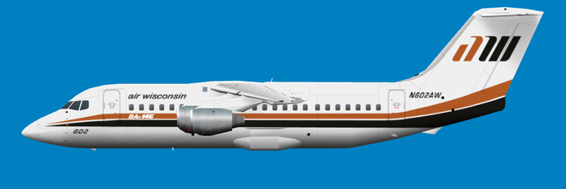 Rushed this one a bit at the end, since im going to a new years party pretty soon and I wanted to get this one done before the end of the year (dont ask me why I dont even know) Anyway the obligatory issues: Registration might need a minor rework since It was the main bit I rushed. Need to find some textron Logos for the engines Some minor colour adjustments (namely the black/brown whatever it is) This was my first experiment at pathing (the tail logo) and im quite happy with it. Also experimented with Gaussian blur on the engines metal textures. Have a Happy New Year everyone! |
|
|
|
Post by ElliottD on Dec 31, 2007 14:56:55 GMT -5
Wow, theyre certainly diverse! Thats part of the logo, more what im after is the little blue triangle thingy as u can see here www.airliners.net/open.file/0673339/L/In my infinite nitpicking Im gonna have to correct the spikes at the end of the cheatlines too ive just noticed. Ill take another look at that cheatline near the door too (I see what you mean, I did say it was a tad rushed lol) |
|
|
|
Post by sierraair on Dec 31, 2007 15:52:56 GMT -5
Looks pretty good to me! I think the registration generally looks okay. I think it just needs a little extra space between the letters but otherwise, the font looks okay. I'd tone down the BAe146 logo. It looks a little bright, although that could be just ACM. If you use the fuselage white, it will probably look fine. The fuselage white is probably something like 0 0 92, since 0 0 100 is way too bright in FS. Don't forget the "Cut Here in Emergency" marks too. I'm mostly lazy and haven't looked at any pictures other than the one you posted, but in that photo, they're there. As for the engine logo, the best part about it is that it's small. You just need a blue triangle with a white slice taken out of it and some white text. Doesn't have to be perfect. In fact, you can do like what I do with little text. Just write "TEXT TEXT TEXT" and it looks fine.  Other than that, I like it! Brian |
|
|
|
Post by jetstar on Dec 31, 2007 16:26:00 GMT -5
Wow, theyre certainly diverse! Thats part of the logo, more what im after is the little blue triangle thingy as u can see here www.airliners.net/open.file/0673339/L/In my infinite nitpicking Im gonna have to correct the spikes at the end of the cheatlines too ive just noticed. Ill take another look at that cheatline near the door too (I see what you mean, I did say it was a tad rushed lol) Hi Elliot. Do you mean something like this?  A small rotated triangle is enough, the resolution is so low that the text cannot be seen or even applied if you keep it to scale. Don't you just love adding the stripes to the tail??  I have just done one with 3 stripes and it was a right royal pain in the ar$e to get then aligned correctly and several hours work to boot!! Now if only we had a full body to make life easier. Well, I guess its not as bad as the AIA DC-9-10 that I have just put the stripe up the tail. At least the 146 tail is the same scale  Just about to upload that one. Looking good. I also think the stripes at the door are to abrupt. The Royal West above is not perfect as my freehand drawing is not to brill. Good work on the tail logo. The Royal West is a modded font rotated and that in its self took the longest part of the repaint. Glad to see some more 146's in the air. Paul |
|
|
|
Post by jetstar on Dec 31, 2007 16:33:58 GMT -5
About the colours.
There is some Air Wisconsin repaints at Avsim. I would colour match to them.
If no repaints are available, like the Royal West I just play around with the dropper until I get something that looks OK in the sim. Its all down to what you think is correct and what looks ok on my monitor may look completely different on another.
Paul
|
|
|
|
Post by ElliottD on Jan 1, 2008 9:40:29 GMT -5
Okay, new and improved 2008 version 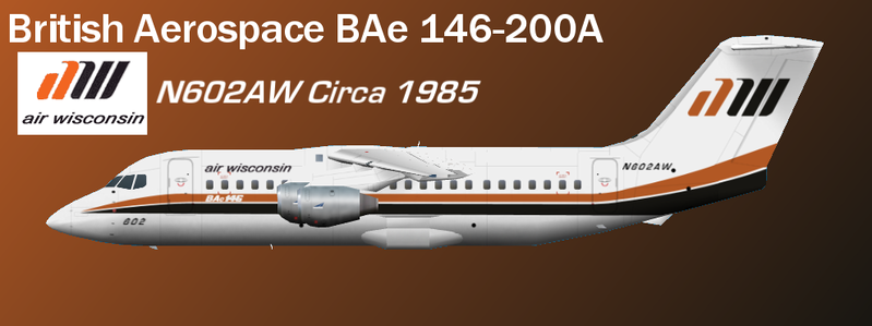 Now comes with Textron logos, cut here lines, a modified cheatline and tweaked registration. So, opinions please. If nobody can see anything else that needs improved ill upload it to AVSIM at some point soon. Jason - bae_pntk.zip at AVSIM |
|
|
|
Post by chrisP on Jan 1, 2008 10:30:29 GMT -5
gratuitous opinion: 70s! 70s! We want the 70s!! btw: nice repaint |
|
|
|
Post by ElliottD on Jan 1, 2008 19:18:46 GMT -5
While working on the Dash 7 I tried modifying the orange a bit, heres the result on the 146: 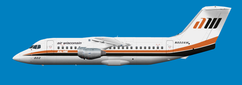 Which is better? This one or the one in the preview shot with the artsy gradient? |
|
|
|
Post by ElliottD on Jan 3, 2008 12:00:30 GMT -5
Thanks Jason. I like artsy gradients too, I just done a quick preview shot to see if that orange looked better than the other. No doubt there will be another artsy gradient done for the final preview shot ;D
|
|
|
|
Post by ElliottD on Jan 5, 2008 19:37:11 GMT -5
awi_146-200_1985.zip at AVSIM
I probably should have checked it in the sim first I just realised but oh well, if anyone does see any errors tell me lol.
|
|